Role & scope
Design lead at Charlie Tango, in collaboration with Karina Kranker on UX and Louise From on UI. Website redesign, design system, illustration universe and Umbraco build.
Kommune
Kredit
KommuneKredit is a Danish special-purpose credit institution, providing funding for the local growth and green transition in municipalities and regions across Denmark.
2022-2024

The project
A full redesign of KommuneKredit’s website. From structure and navigation to visual direction, illustrations, and a component based design system.
The site was built to support a large Umbraco setup, where reusable components and CSS guidelines made it possible to create new pages flexibly while keeping the experience consistent and on brand.
The research
Before anything was designed, we ran misanplas workshops with KommuneKredit to understand their visual preferences and what they wanted to move away from. We benchmarked peer institutions to see how others use illustration, colour and personality in a financial context. User testing followed to pressure-test our decisions. I sat in on the tests to see whether what we were building actually landed.
The design
The brief sounds simple: make it airy, modern, and welcoming. In practice, that meant navigating a lot of opinions, a large Umbraco build, and the constant question of how far we could push the personality before it stopped feeling like a financial institution. We landed on not bubbles, not squares, somewhere deliberate in between.

The design
The brief sounds simple: make it airy, modern, and welcoming. In practice, that meant navigating a lot of opinions, a large Umbraco build, and the constant question of how far we could push the personality before it stopped feeling like a financial institution. We landed on not bubbles, not squares, somewhere deliberate in between.

Illustrations
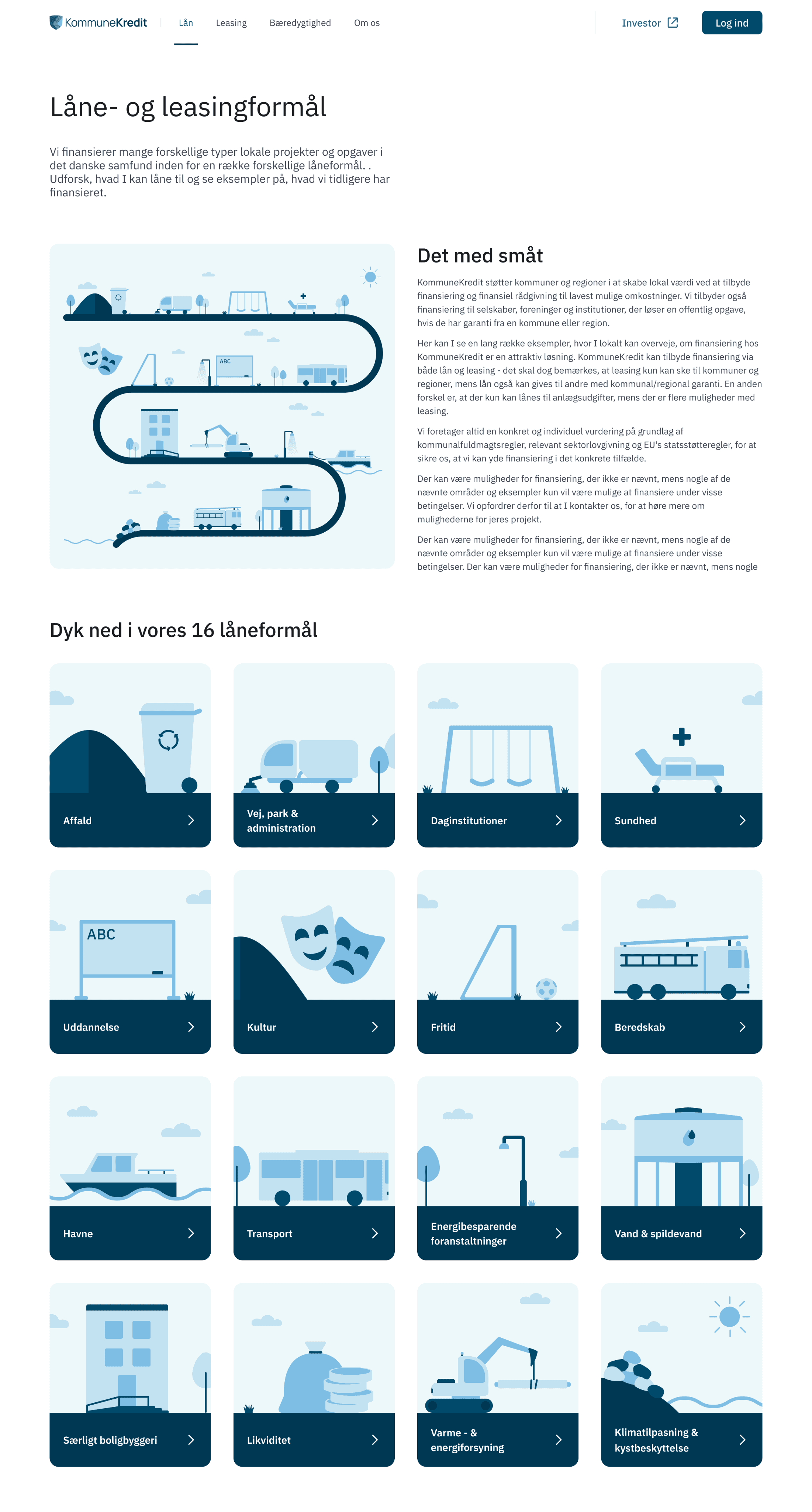
A simple illustration style was developed to support communication across the site. The illustrations are used selectively to explain concepts, guide attention, and add warmth, without overwhelming the interface.
Affald
Energibesparende foranstaltninger
Impact
Since launch, KommuneKredit's own content team has been building and publishing new pages themselves, no design support needed. The components and structure hold up on their own, which was the whole point of building it as a system rather than a one-off design. From what I've heard back, the team finds it straightforward to work with.
Kommune
Kredit
KommuneKredit is a Danish special-purpose credit institution, providing funding for the local growth and green transition in municipalities and regions across Denmark.
2022 - 2024
Role & scope
Design lead at Charlie Tango, in collaboration with Karina Kranker on UX and Louise From on UI. Website redesign, design system, illustration universe and Umbraco build.
The project
A full redesign of KommuneKredit’s website. From structure and navigation to visual direction, illustrations, and a component based design system.
The site was built to support a large Umbraco setup, where reusable components and CSS guidelines made it possible to create new pages flexibly while keeping the experience consistent and on brand.
The research
Before anything was designed, we ran misanplas workshops with KommuneKredit to understand their visual preferences and what they wanted to move away from. We benchmarked peer institutions to see how others use illustration, colour and personality in a financial context. User testing followed to pressure-test our decisions. I sat in on the tests to see whether what we were building actually landed.
The design
The brief sounds simple: make it airy, modern, and welcoming. In practice, that meant navigating a lot of opinions, a large Umbraco build, and the constant question of how far we could push the personality before it stopped feeling like a financial institution. We landed on not bubbles, not squares, somewhere deliberate in between.
Role & scope
Design lead at Charlie Tango, in collaboration with Karina Kranker on UX and Louise From on UI. Website redesign, design system, illustration universe and Umbraco build.
Kommune
Kredit
KommuneKredit is a Danish special-purpose credit institution, providing funding for the local growth and green transition in municipalities and regions across Denmark.
2022
The project
A full redesign of KommuneKredit’s website. From structure and navigation to visual direction, illustrations, and a component based design system.
The site was built to support a large Umbraco setup, where reusable components and CSS guidelines made it possible to create new pages flexibly while keeping the experience consistent and on brand.
Kommune
Kredit
KommuneKredit is a Danish special-purpose credit institution, providing funding for the local growth and green transition in municipalities and regions across Denmark.
2022-2024
Role & scope
Design lead at Charlie Tango, in collaboration with Karina Kranker on UX and Louise From on UI. Website redesign, design system, illustration universe and Umbraco build.
The project
A full redesign of KommuneKredit’s website. From structure and navigation to visual direction, illustrations, and a component based design system.
The site was built to support a large Umbraco setup, where reusable components and CSS guidelines made it possible to create new pages flexibly while keeping the experience consistent and on brand.
The research
Before anything was designed, we ran misanplas workshops with KommuneKredit to understand their visual preferences and what they wanted to move away from. We benchmarked peer institutions to see how others use illustration, colour and personality in a financial context. User testing followed to pressure-test our decisions. I sat in on the tests to see whether what we were building actually landed.
The design
The brief sounds simple: make it airy, modern, and welcoming. In practice, that meant navigating a lot of opinions, a large Umbraco build, and the constant question of how far we could push the personality before it stopped feeling like a financial institution. We landed on not bubbles, not squares, somewhere deliberate in between.
Affald
Energibesparende foranstaltninger
Illustrations
A simple illustration style was developed to support communication across the site. The illustrations are used selectively to explain concepts, guide attention, and add warmth, without overwhelming the interface.
Impact
Since launch, KommuneKredit's own content team has been building and publishing new pages themselves, no design support needed. The components and structure hold up on their own, which was the whole point of building it as a system rather than a one-off design. From what I've heard back, the team finds it straightforward to work with.