Role & scope
Design lead and UI designer at Charlie Tango. App design, brand, design system and white label solution.
Min Forsyning
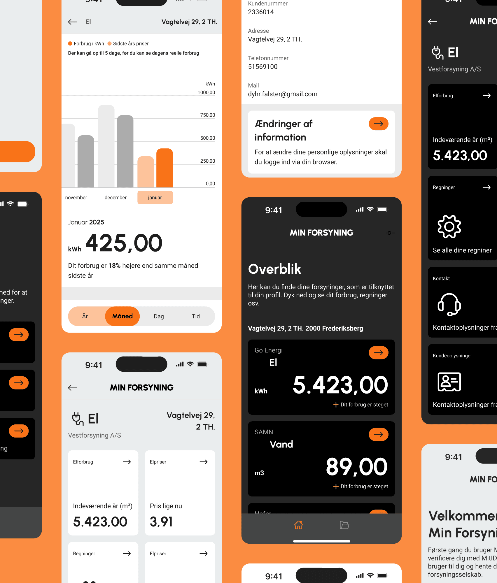
Danish digital platform used by utility companies across energy and water. Their customers, both private and business, use it to manage contracts, track consumption and access invoices.
2024


The project
MinForsyning wanted to update their digital experience. The brief was to build something that could work across multiple clients, each with their own branding, so the whole thing had to be designed as a white label solution from day one.
The core challenge was building a system flexible enough to adapt to different clients while still feeling coherent. Every decision had to work twice, once with the default setup and once if a client brought in completely different colours or a wider font. The design system was built so only colours and typography could be swapped out while the overall structure stays consistent.
Colour
Orange was chosen as the primary colour because most utility companies already lean on green and blue. Orange contrasts strongly enough that it's unlikely to clash with whatever a client brings. The white label system means a client like HOFOR can swap the primary colour to their own green and the whole app shifts with it, while the structure stays exactly the same.

Typography
Same with sizing and spacing. It had to hold up even if a clients font was wider og heavier than the default. The system was built with that flexibility in mind from the start.


Some people live in dark mode, some swear by light. The app was designed to feel intentional in both, not just a colour flip but a considered experience either way.
Some people live in dark mode, some swear by light. The app was designed to feel intentional in both, not just a colour flip but a considered experience either way.
Go Energi
El
kWh
4.754,00
Dit forbrug er steget
Go Energi
El
kWh
4.754,00
Dit forbrug er steget
Go Energi
El
kWh
4.754,00
Dit forbrug er steget
Go Energi
El
kWh
4.754,00
Dit forbrug er steget
Some people live in dark mode, some swear by light. The app was designed to feel intentional in both, not just a colour flip but a considered experience either way.
Go Energi
El
kWh
4.754,00
Dit forbrug er steget
Go Energi
El
kWh
4.754,00
Dit forbrug er steget
© Web design / Deborah Karva
Min Forsyning
Danish digital platform used by utility companies across energy and water. Their customers, both private and business, use it to manage contracts, track consumption and access invoices.
2024
Role & scope
Design lead and UI designer at Charlie Tango. App design, brand, design system and white label solution.
Min Forsyning
Danish digital platform used by utility companies across energy and water. Their customers, both private and business, use it to manage contracts, track consumption and access invoices.
2024
Role & scope
Design lead and UI designer at Charlie Tango. App design, brand, design system and white label solution.
The project
MinForsyning wanted to update their digital experience. The brief was to build something that could work across multiple clients, each with their own branding, so the whole thing had to be designed as a white label solution from day one.
The core challenge was building a system flexible enough to adapt to different clients while still feeling coherent. Every decision had to work twice, once with the default setup and once if a client brought in completely different colours or a wider font. The design system was built so only colours and typography could be swapped out while the overall structure stays consistent.
© Web design / Deborah Karva
© Web design / Deborah Karva
Colour
Orange was chosen as the primary colour because most utility companies already lean on green and blue. Orange contrasts strongly enough that it's unlikely to clash with whatever a client brings. The white label system means a client like HOFOR can swap the primary colour to their own green and the whole app shifts with it, while the structure stays exactly the same.
Typography
Same with sizing and spacing. It had to hold up even if a clients font was wider og heavier than the default. The system was built with that flexibility in mind from the start.