Role & scope
UI designer at Charlie Tango. Visual identity, UX, UI and design system. Adapting an existing component structure into a new standalone brand.
Ældre
Reformen
Reform portal bringing together materials, guidelines and news for leaders and staff in Danish elder care. Built across three government organisations, each with their own brand.
2025

The project
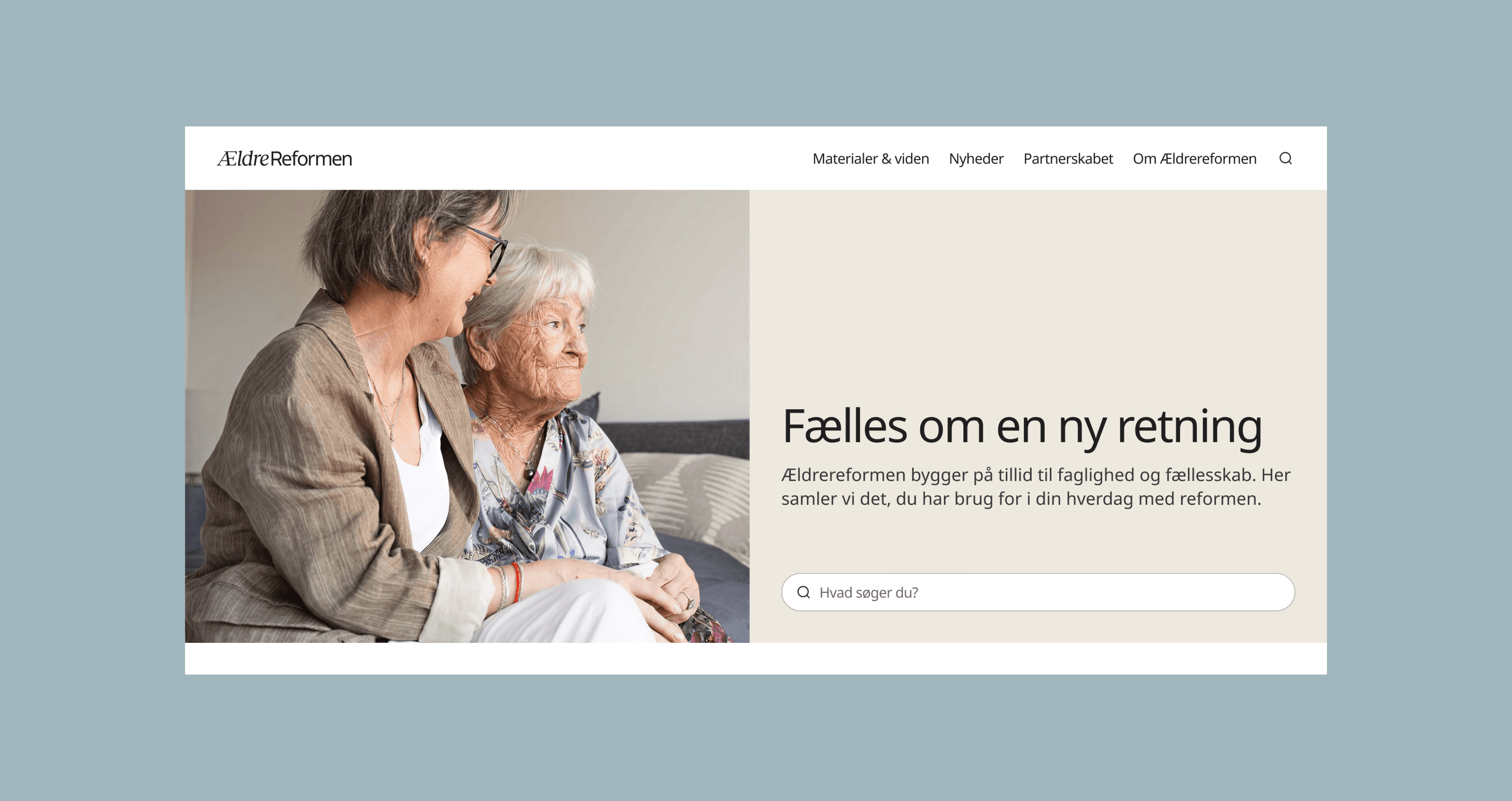
ÆldreReformen.dk is a reform portal built to support the implementation of Denmark's Elder Reform. The goal was to give leaders and staff in elder care one place to find materials, guidelines and news — with the Ministry of Elder Affairs, the Danish Health Authority and Local Government Denmark as joint commissioners.
The challenge was that three government organisations needed a shared space that felt neutral enough not to favour any of them. At the same time, the components had to mirror the Health Authority's existing design system almost exactly. Same structure, same content hierarchy: if they had a button, so did ÆldreReformen. Only small visual adjustments were on the table.
The real task was creating something with its own identity within those constraints.
The identity
The whole identity is built on the balance between the human and the formal. That tension runs through everything.
The cooler colours: blue, grey and purple. Sit on the formal side, each nodding to one of the three commissioners. The forms are angular. On the human side the palette shifts to warmer tones: orange and sand. The forms soften and round out. The two sides share the same neutral base so they always sit comfortably together.
The goal was something that felt trustworthy without feeling like just another government site.


The logo
The website
The logo pairs two typefaces that each carry their own meaning. "Ældre" is set in a serif italic - warm, personal, human. "Reformen" is set in a clean sans-serif - structured, formal, institutional. The two sit side by side, just like the reform itself asks care workers and policy to sit side by side
All page types were designed in Figma and specced for handoff: homepage with search and news carousel, materials overview with filters, news overview, content pages and search results. The component library was built to match the Health Authority's structure while giving editors flexibility to maintain the portal across its three-year lifespan.
The logo
The logo pairs two typefaces that each carry their own meaning. "Ældre" is set in a serif italic - warm, personal, human. "Reformen" is set in a clean sans-serif - structured, formal, institutional. The two sit side by side, just like the reform itself asks care workers and policy to sit side by side
The website
All page types were designed in Figma and specced for handoff: homepage with search and news carousel, materials overview with filters, news overview, content pages and search results. The component library was built to match the Health Authority's structure while giving editors flexibility to maintain the portal across its three-year lifespan.

The website
All page types were designed in Figma and specced for handoff: homepage with search and news carousel, materials overview with filters, news overview, content pages and search results. The component library was built to match the Health Authority's structure while giving editors flexibility to maintain the portal across its three-year lifespan.
© Web design / Deborah Karva
Ældre
Reformen
Reform portal bringing together materials, guidelines and news for leaders and staff in Danish elder care. Built across three government organisations, each with their own brand.
2025
Role & scope
UI designer at Charlie Tango. Visual identity, UX, UI and design system. Adapting an existing component structure into a new standalone brand.
Ældre
Reformen
Reform portal bringing together materials, guidelines and news for leaders and staff in Danish elder care. Built across three government organisations, each with their own brand.
2025
Role & scope
UI designer at Charlie Tango. Visual identity, UX, UI and design system. Adapting an existing component structure into a new standalone brand.
The project
ÆldreReformen.dk is a reform portal built to support the implementation of Denmark's Elder Reform. The goal was to give leaders and staff in elder care one place to find materials, guidelines and news — with the Ministry of Elder Affairs, the Danish Health Authority and Local Government Denmark as joint commissioners.
The challenge was that three government organisations needed a shared space that felt neutral enough not to favour any of them. At the same time, the components had to mirror the Health Authority's existing design system almost exactly. Same structure, same content hierarchy: if they had a button, so did ÆldreReformen. Only small visual adjustments were on the table.
The real task was creating something with its own identity within those constraints.
© Web design / Deborah Karva
© Web design / Deborah Karva
The identity
The whole identity is built on the balance between the human and the formal. That tension runs through everything.
The cooler colours: blue, grey and purple. Sit on the formal side, each nodding to one of the three commissioners. The forms are angular. On the human side the palette shifts to warmer tones: orange and sand. The forms soften and round out. The two sides share the same neutral base so they always sit comfortably together.
The goal was something that felt trustworthy without feeling like just another government site.
The website
All page types were designed in Figma and specced for handoff: homepage with search and news carousel, materials overview with filters, news overview, content pages and search results. The component library was built to match the Health Authority's structure while giving editors flexibility to maintain the portal across its three-year lifespan.
The logo
The logo pairs two typefaces that each carry their own meaning. "Ældre" is set in a serif italic - warm, personal, human. "Reformen" is set in a clean sans-serif - structured, formal, institutional. The two sit side by side, just like the reform itself asks care workers and policy to sit side by side

The project
ÆldreReformen.dk is a reform portal built to support the implementation of Denmark's Elder Reform. The goal was to give leaders and staff in elder care one place to find materials, guidelines and news — with the Ministry of Elder Affairs, the Danish Health Authority and Local Government Denmark as joint commissioners.
The challenge was that three government organisations needed a shared space that felt neutral enough not to favour any of them. At the same time, the components had to mirror the Health Authority's existing design system almost exactly. Same structure, same content hierarchy: if they had a button, so did ÆldreReformen. Only small visual adjustments were on the table.
The real task was creating something with its own identity within those constraints.